Thursday, 18 December 2014

ancillary production pitch

In 5 words describe the overall theme/ style of the ancillary products
  • simple
  • calm 
  • youthful
  • passionate
outline how may panels your digipak will be
  • i will have 4 panels 
  • the artists will be shot in different angles
state where your magazine advertisement will be placed
  • RWD magazine
say where you got your ideas from

  • I got my ideas from similar artists that i thought best matched 'victor mase' genre of music and brand identity for example sam smith , ed sheeran , lorde , and labrith 

Monday, 15 December 2014

Album cover research : rough copy of album


album cover research : digipak ' potential shots


research for album cover : different types of shots for photoshoot

Here are the different type of shots i would like to take for the photo shoot tomorrow :
(tuesday 16th december 2014)

Ideas for the front of the album :

I would like there to be a close up shot of the artists on the front of the album.

1.

   2.


ideas for inside the digipak :

1. 
2.
i would like the cd panel to have a grayscale effect like image number 2  and maybe the artists the same way 'lorde' is in this image .

album cover research : other font types from the internet

I went online and looked at other webpages that may have a lot more font types that i could possibly use.

here are the webpages that i viewed:

Add caption


album cover research : possible fonts I may use

from spotlight search browser i typed in font book and it gave a load of different fonts that i could look at to consider in my album cover for my artist ' victor mase'.

Here are a few fonts that i feel may suite my genre and artist :

1. Joybuzzer


2. Harlem

3. Autos

4. Chalk duster

5. Traveling typewriter


as this is a album cover and would like the audience to read the artist name , album name and tracl lists clearly i am only going to use 2 fonts.

Album cover research

The Genre for my artist is pop. However it is not the usual type of 'pop' that we are likely to see with some famous pop artists e.g lady gaga or madonna.

Analysing real artists that are similar to my artist 'victor mase':


Ed sheeran's first album had an orange background with his face in the forefront. This is a great way for him to make himself memorable to the target audience but also lets his brand identity stand out. the orange background is also acts as a indirect message that he has 'ginger' hair.

sam smiths first album also has a shot of him in the forefront. however here we see a mid shot of sam sitting on a chair, with a grey background which i think reemphasises the title wordplay 'in the lonely hour'. this is great way for the audience to visual identify what type of music  the artists has put together on the album.

Monday, 8 December 2014

analysis of previous students work - digipak and advertisement

Powered by emaze

finished music video


ancillary brief -analysis of two seperste ancillary work and videos done by previous students

I thought 'video 10' group created a good digipak as well as music video for a number of reasons …….

  • They kept the font the same throughout the digipak and it was also a very clear font for the audience to view clearly.
  • although they used graphics  for the band in the digipak , there images are not stretched but instead are fitted to the size of the shape of the digipak
  • they also kept the background the same- which allows the audience to become familiar with the brand of the band
  • i also like the fact that all member of the band are shown clearly but in an animated form. Not only does it stand out from other  digipaks but it hides the artists identity which consequently draws the audiences to wanting to actually get to watching the music video.
  • the digipak and the advertisement do not have images taken from the original music video. which is good because it shows that the  group were careful in choosing the right image to represent the band. 
  • they also did not place any texts over the bands faces. there are also no unnecessary photos on every panel
  • moreover i feel that the cd cover was a very smart idea as it is a great way to use synergy between the music video and album without letting the viewers know directly what the hit single is about
  • i like the fact that the magnifying glass and diamond acts as a prop on the cd cover
what i did not like about 'video 10' group digipak and advert…….
  • i felt that the 'bands' name did not stand out well enough. i felt that maybe if they made the font on the brand name bolder it would have stood out a bit more.
  • i felt that what the artists in band were wearing was dull and so they should have worn a little bit of brighter clothes. 

Friday, 5 December 2014

editing process and changes made along the way.......

1) changes made ...........

  • I had to get rid of the day shots simply because i did not have shots of the couple together during the day . this is because both actors were very busy during the week and so it was difficult to get the artists together at a certain time on some days. i replaced the day shots with night shots of the artists singing the song the whole way through at different angles.
2) Editing process.......
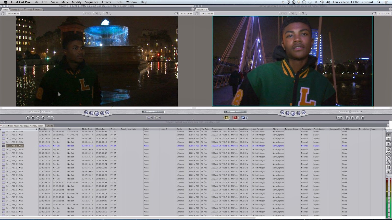
  • as stated earlier in the blogging process i have been using final cut pro to edit. i have included only a few transitions. this because i felt that the cuts to the next locations were a bit to rough and so i wanted to give it a smooth finish.

I FOUND AN ACTRESS FOR THE MUSIC VIDEO :)

After a long search for an actress for the music video and numerous opportunities to consider taking up the part of 'victor mase' girlfriend in the music video . I  finally got someone to play this part instead of my self.

Fact file of the actress : 

  • age: 17
  • name: towmi
  • school/college : city and islington sixth form college
  • other facts : is currently taking part in her own media music video 

Fact file of the actor :

  • age : 19
  • birth name : tariq
  • artists name : victor mase
  • in school or college: college
  • other facts : has already done his A2 media music video last year 

Monday, 1 December 2014

reflection on progress so far part 2


rough cut review by teacher and classmates

student review on rough cut :


teacher review on rough cut  :

rough cut- 2 ( class reviewed )


my progress review from teacher- how i plan to improve and my targets

looking at my progress review my teacher has commented and described exactly what i should be doing better and differently . The 3 that have stood out to me the most are …….


my personal goal for this week is to complete - my music video before deadline on friday :)

my progress review from teacher


so far i have been on top of the work set for blogging. however my main aim for this week is to get 20 more blog posts by the end of this week. also lately it has been rather difficult to film because the actors in my music video are very busy especially with school work and so i have had to change filming dates several times. for example this weekend that just went by i had to reschedule because 'victor' was sick and so we have decided to film on monday 1st December around 3pm. unfortunately today is the only day the actor is available which means that we have to shoot a variety of shots today as the deadline for music video is friday.
 1. this first image is the artists explaining that he is busy this week especially.
2. this second image is the artists letting me know that he is ill on saturday